Wow! Where has the year gone? 2012 was wonderfully busy!
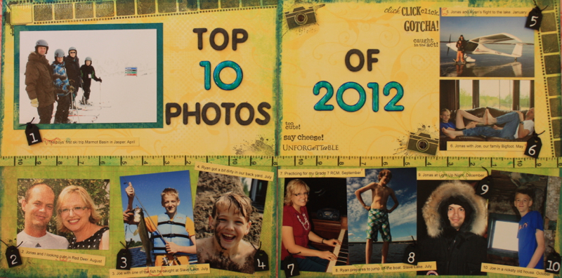
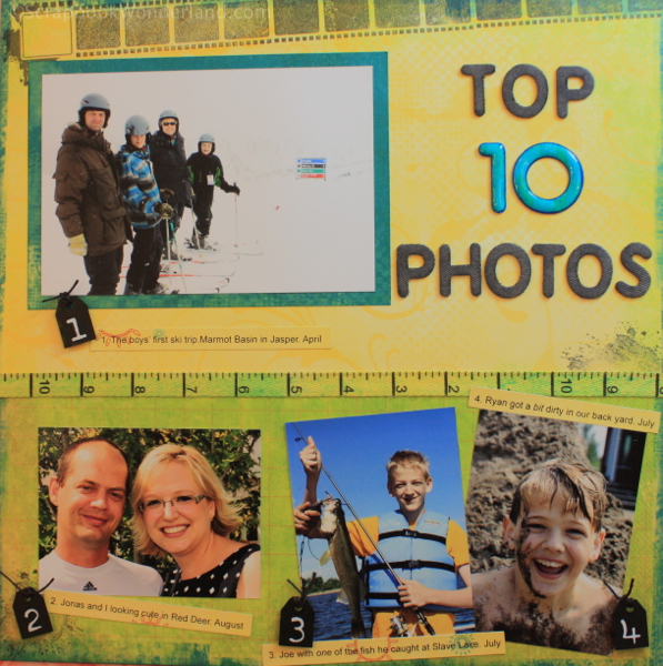
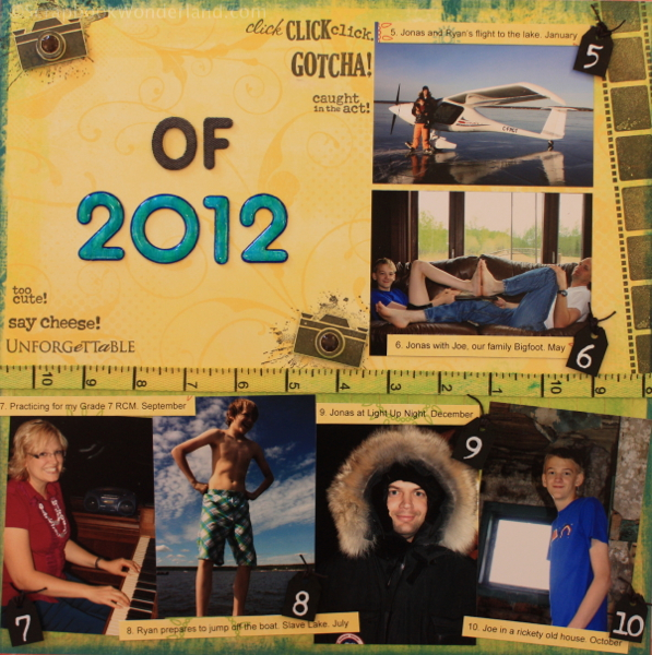
To commemorate this amazing year I wanted to create a layout that would capture some of the highlights.Here are my Top 10 Photos of 2012.
You can choose to feature a variety of types of Top 10 photo lists:
- Best People Photos
- Place we went
- Most exciting moments
- Best Nature photos
- Best memories
- Do a top 12 and choose one for each month
I chose to highlight some of my favourite family photos from the year.
There are several ways to incorporate multiple photos onto a layout. Some of the tricks I used are:
- Make the photos smaller (They don’t have to be too tiny! Most of these photos are 4×3)
- Line photos up in rows (See the bottom row of my layout)
- The row of photos don’t have to be straight! (Oh my!) See how the bottom row of photos are slightly askew… it makes it feel less structured and more playful.
Lets look at some of the details that accent this layout.
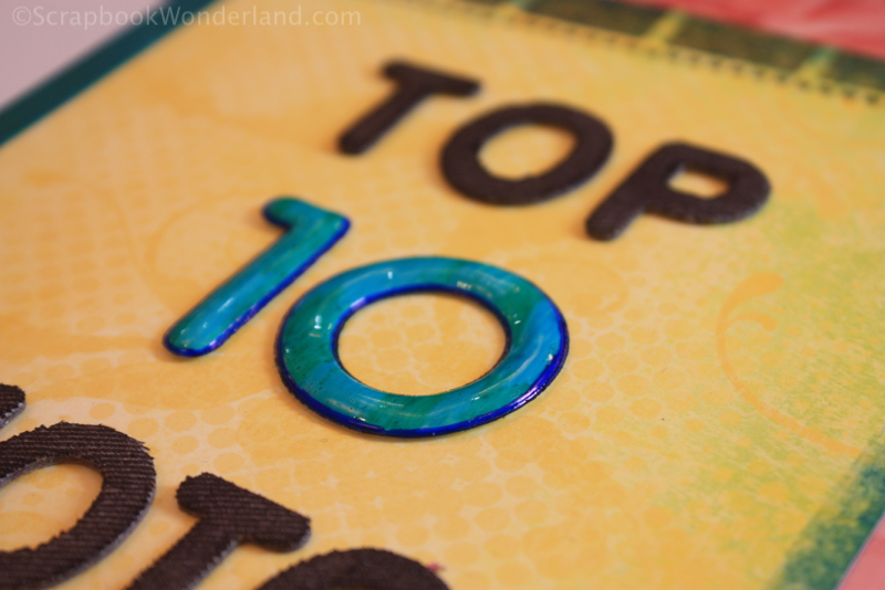
I used two different styles of stickers for the title. The contrast between the two styles (shiny and canvas) adds a lot of character.
The sticker for the numbers were white letters. I coloured them with Sharpie markers to create the custom blue-green colour.
The word stickers are canvas. They were coloured with ink using a sponge dauber. (Canvas Alphabet available from Close to My Heart) See full supply list at the bottom of the post.
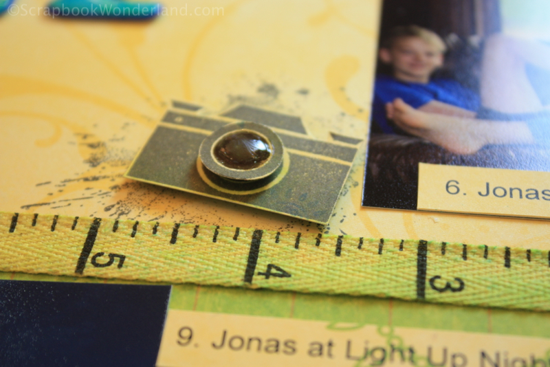
The camera is a stamped image. It is popped up using foam tape. The camera lens was stamped again so it could be popped up more. Liquid glass was applied to the lens to make it shiny. To keep the camera from ‘floating’ on the page I mounted it on top of an ink splat stamped image.
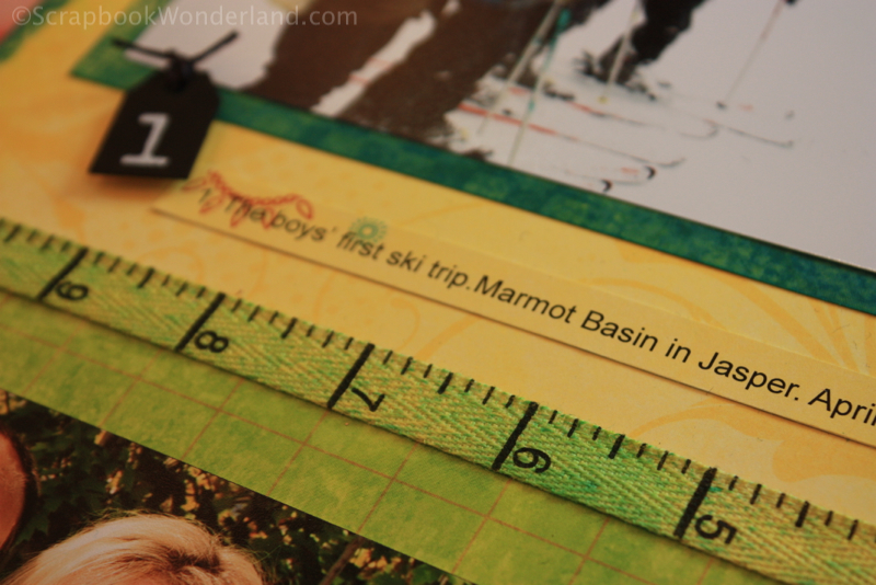
The tape measure ribbon was custom coloured by spraying yellow ink onto it. Then I sprayed a few areas with some teal blue ink.
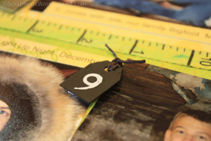
Each of the photos is ‘tagged’ with a small tag. The numbers are added using rub-ons. I will share a few details about these soon!
Page Elements:
- Paper: BoBunny – Flower Child
- Number Stickers: Thickers – Chit Chat (white)
- Tags: Die Cuts with a View – Metallic Accents
- Measuring Tape Ribbon: misc. bulk
- Stamp sets: Picture Perfect and Instant Memories- Close to My Heart
- Letter stickers: Canvas Alphabet – Close to My Heart
- Hemp twine: Black – Close to My Heart
- Liquid Glass: Close to My Heart
- Foam tape, black ink, adhesive – Close to My Heart
(If you are in Canada and would like Close to My Heart products you can shop online HERE.)
What is your favourite element? Have you ever created a Top 10 Layout? What techniques did you use to scrapbook multiple photos? I’d love to hear your comments!
Alice.


Comments on this entry are closed.
I have been looking for ways to put together a 2012 highlights page and you really have great ideas here! Thank you!
Awesome! If you post it online come back and share the link!