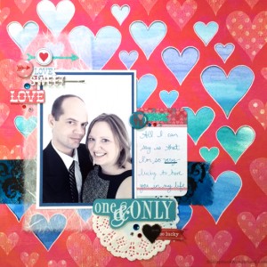
 Once in a while it happens. I end up with a photo that I truly LOVE!
This time it was a photo of my husband and myself together! Yay!
I couldn’t wait to scrapbook this photo and I wanted to make sure that the scrapbook page I created would be extra special.
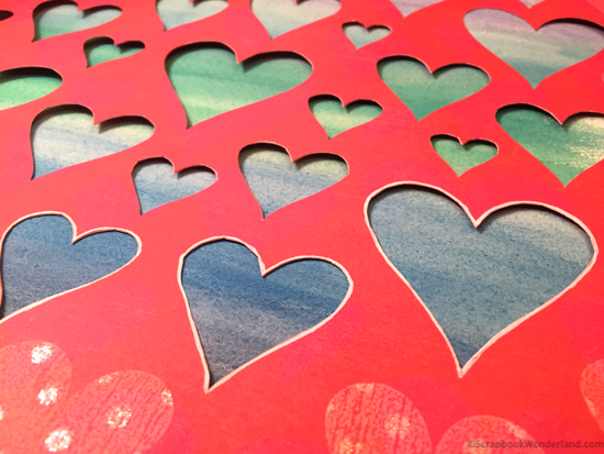
Have you ever had a leftover bit of paper that is just too good to get rid of? Of course! I found a cool piece of paper that I had cut hearts out of for another scrapbook layout.
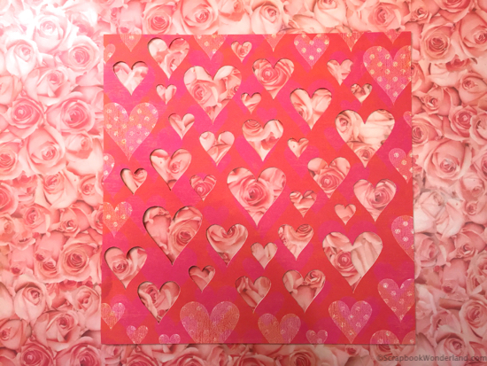
Isn’t this a cool looking leftover? Wouldn’t you have saved it too?
The question was… what was I going to do with it? Hmmmm…
I decided that playing with ombre watercolour effect would be a pretty fun thing to do. Not only would I get to play with my paints, but the results are always so gorgeous, even if I lack skills in the painting department. 😉
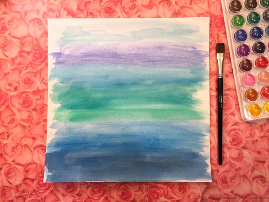
I used this watercolor paper: Prima Marketing Watercolor Paper Pad 7 *affiliate link
After painting this watercolour paper using shades of blue…
Why Blue?
It made a pretty contrast against the hearts and I love creating an ombre effect with shades of blue. <3
I also love that it’s not a traditional colour for a “LOVE” layout!
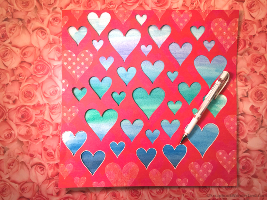
Looking at it, I decided I needed the hearts to be a bit more defined, so I traced them with a white gel pen.
This is the white gel pen I use: Uni-Ball Signo Broad Point Gel Impact Pen White Ink *affiliate link
The Layout!
Here’s the layout with the photo I love!
Don’t the blue ombre hearts look awesome? Love it!

Let’s talk about photo effects for a second. I considered printing the photo in black and white, but instead I really liked the faded colour effect more. Do you play with faded colours on your photos? It’s a cool way to keep the colour, but make it subtle.
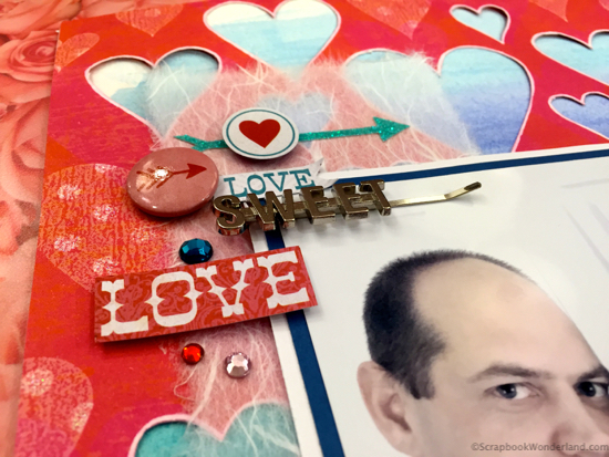
I went old-school and pulled out some mulberry paper to slip behind the photo. I love the softness it adds to the page while remaining translucent.
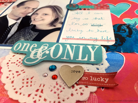
I was watching a friend’s Periscope today and several of her recent pages have had doilies. I loved her pages so I thought it would be fun to add them to my layout too! Thanks for the inspiration Cara!
Want to see what I’m sharing on Periscope? Follow me @aliceboll
Design Tips to Try:
- Use blue or another non-traditional colour on a “LOVE” layout.
- Try ombre. It’s fun to create and it’s beautiful too!
- Watercolour, if I can do it you can too. Use watercolour paper, it makes all the difference!
- Use a special leftover that you’ve been saving because it was too good to let go of.
 Make it Monday
If you’ve arrived from Alison Day Designs… welcome! Alison is embracing all the red to make a special Valentine for her husband.
Your next stop is to Kristie Sloan where Kristie will show you that small tags result in a big decor idea throughout the year!
I hope you’ll go and create something that you love today!
Alice.


Comments on this entry are closed.
This page is so cool!! I love how you did the background. It was really neat to see how you did it on periscope!
Thanks Cara!