Stash Bash Guest Post!
I have exciting news! I have a guest post over on Alison Day Designs sharing 10 Ways to Bust your Stash! If you have a few goodies but oldies in your scrapbook stash these ideas are for you!
Scrapbook Layout Inspired by a Card Sketch
When I create a beautiful card, I like to think about how I could use that card to inspire a scrapbook layout. If I can use one source of inspiration to make several projects that’s a huge bonus!
Recently I shared a congratulations card and a variation and sketch of this card.
First I showed how you could create a card using a different colour scheme.
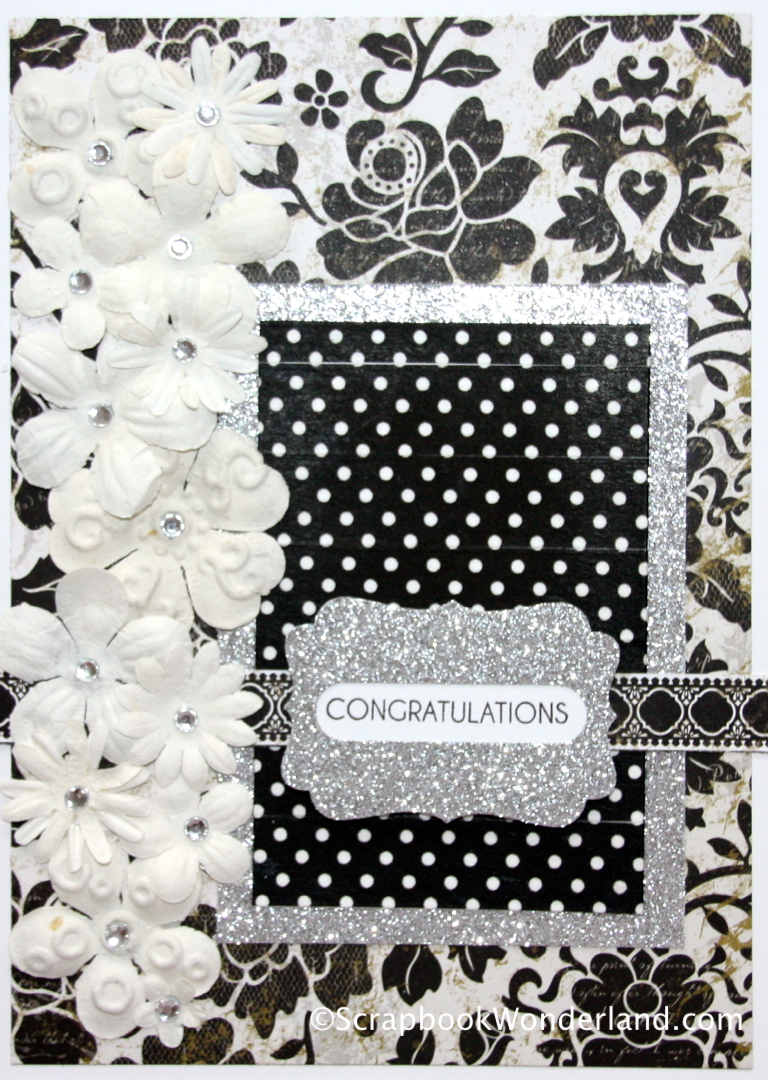
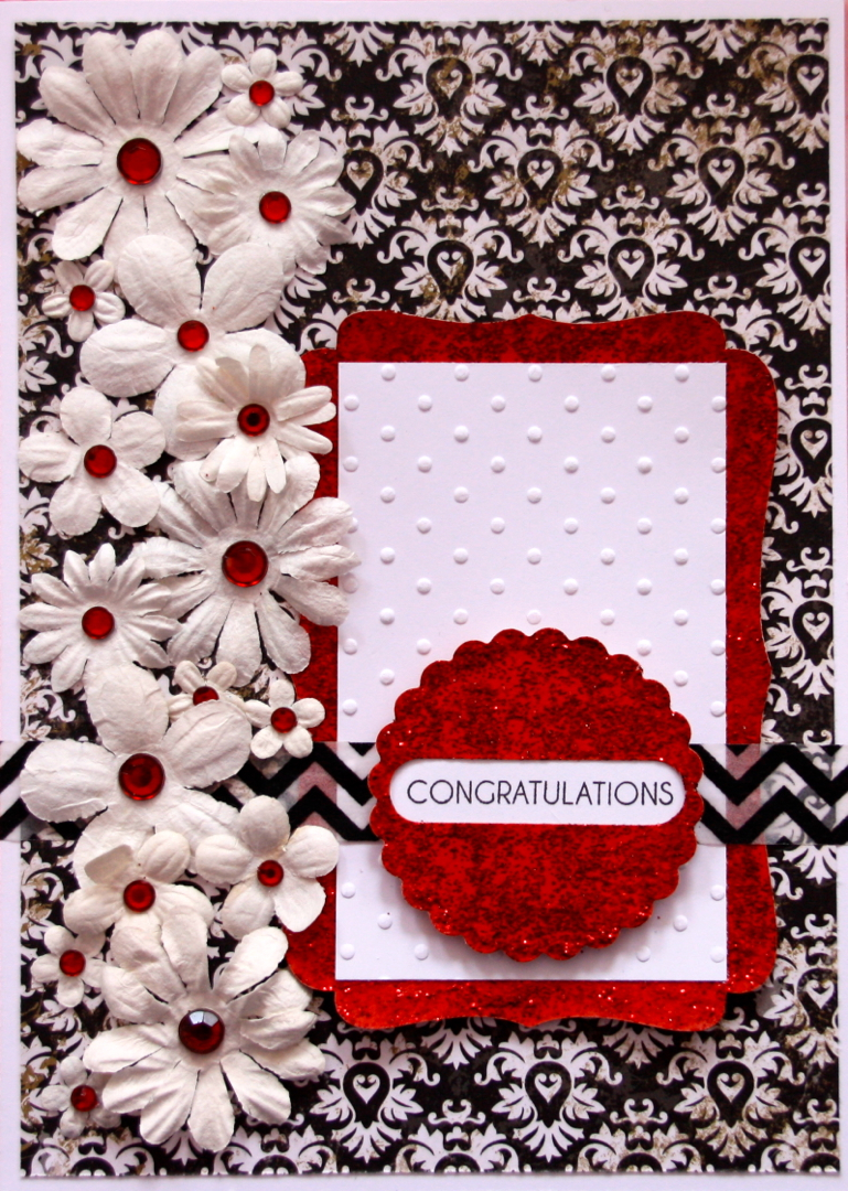
When you break the card down into its basic elements you have this basic sketch.
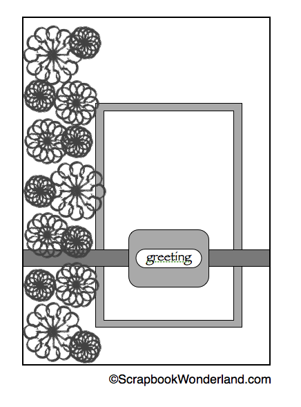
Use a Card Sketch to Design a Layout
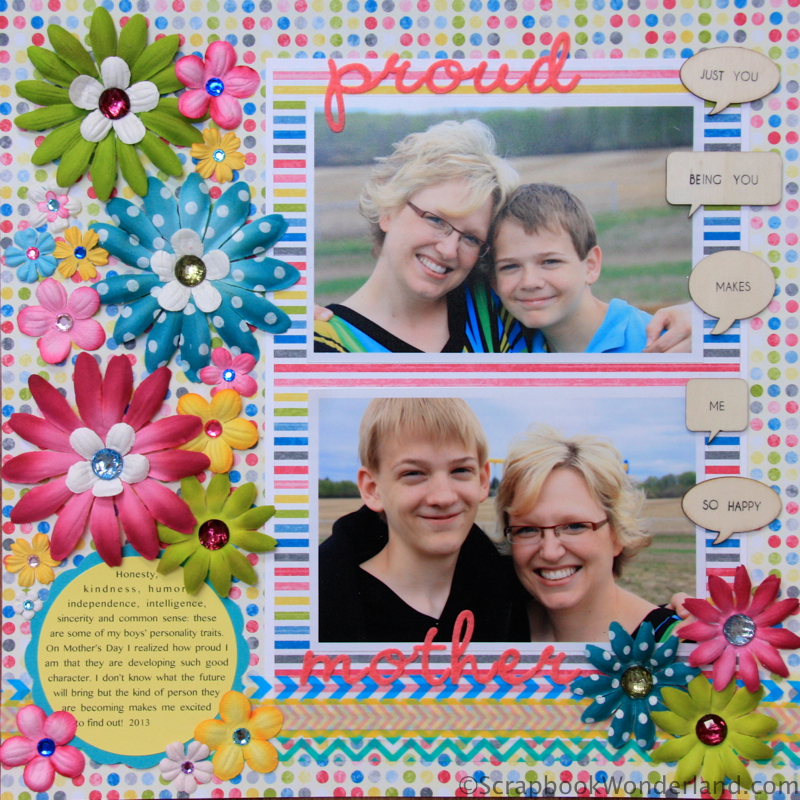
With only a few minor adjustments this card sketch can be used to create a layout.
Look at the main elements of the card design. Decide how you can adapt those to a layout. For this sketch I kept these 3 main design features:
- Embellishments.
- The rectangle of patterned paper.
- The strip across the page.
To make the layout work I had to alter the design by:
- Moving the greeting/title.
- Adding space for journaling.
- Adding a few extra embellishments.
Design Elements to Keep
1. Keep the main embellishments in their location. For this sketch the flowers are running down the left side.
2. Find a place to insert your photos. I like the idea of replacing the rectangle of patterned paper with my photos.
3. For the strip across the page I used a few layers of washi tape. Having an element that reaches across the whole page draws your eye across and breaks up the page. (The chevron patterned washi tape is especially great for drawing your eye across the page!)
Alter the Design
1. Check the location of the title. Will it still work now that you have placed your photos? If my title was a single word it would have fit nicely in between the two photos, but with two words I shifted one above and one below the photos.
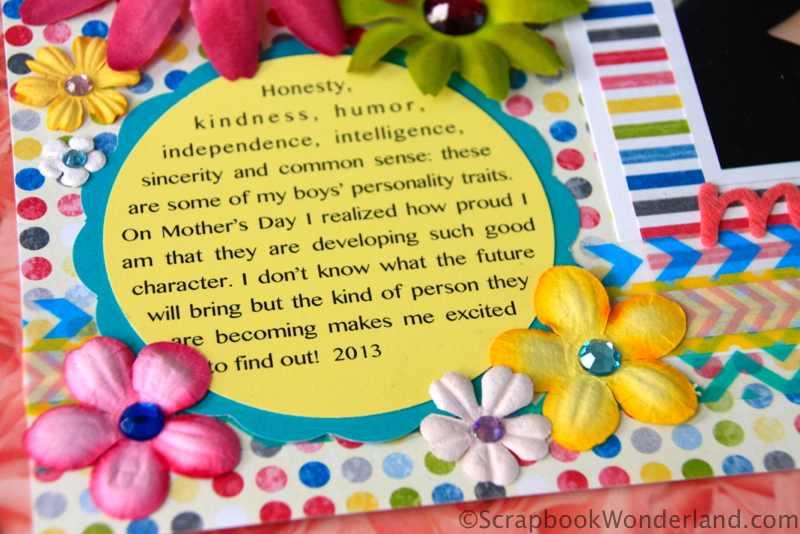
2. One of the most important things on a scrapbook page is the journaling. (Do you disagree? Read THIS post!) I like to keep the journaling as a part of the design process. By planning for journaling you are more likely to include it. On this page I planned for the journaling to be a part of the floral embellishment along the side of the layout.
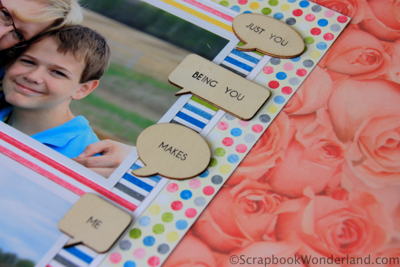
3. With a 12×12 scrapbook page I had much more space for embellishment than I would with a card. Although I could have kept the floral embellishment solely along the left hand side I added a few more flowers and some wood veneer caption bubbles along the right side.
I hope this will help you take a card design that you love and create a stunning scrapbook layout. Don’t forget to pop over to Alison Day Designs to see the guest post I shared with 10 Ways to Bust your Stash!



Comments on this entry are closed.
Alice, what a fantastic post. I love seeing your process for adapting a sketch. So many great tips here! I love that layout! It is so bright and color, but well balanced at the same time. Thank you for sharing it in the Patterned Paper Palooza!
Thanks Kelli!
I love it Alice – thank you so much for taking us to the next level. Stunning absolutely stunning. 🙂
Thank you Sharon!
I have taken card classes to inspire me with scrapbooking- then get caught up in making cards and forget the original reason. Thank you for reminding me why! This is a very simple, creative way to go back and look at the cards I love to make pages I love.
I love that cards are an extension of my scrapbooking but that they can also inspire my scrapbooking. Thanks for commenting Mary Jo!