Ah travel! It speaks to your soul. Your inner sense of adventure and exploration.
How do you capture the feelings and emotions of travel on a scrapbook layout?
In this post we’ll talk about 3 design tips that work.
3 Design Tips to Capture Feeling on Travel Layouts
Colour
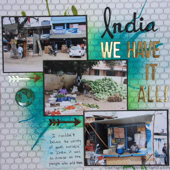
If you are scrapbooking about a place that is vibrant and full of life you want to use colours that help show that.
Don’t forget that different tones of colours will also be important. For adventure use bright colours, and try muted tones for more relaxed pages.
Shapes and Symbols
Incorporating shapes and symbols on a travel page will help you capture the spirit of your page.
Take a look at the layout above. The shapes on the background paper, the chaos of the paint/spray, and the use of arrows all contribute to the feeling of chaos and excitement that help to capture the feeling of India.
Flow
The way the page flows can be used to help convey the feeling of your layout. The way the photos overlap in the example help your eye flow from one photo to the next. This is great for a place that has a lot of action or activity.
If you were scrapbooking a place that was stark or austere or very formal you would disconnect your photos by keeping them separate and alone, not touching and flowing.
Next time you scrapbook your travels be sure to use colour, shapes and symbols, and flow to breathe life into your pages.
Happy scrapbooking!
Alice.


Comments on this entry are closed.
Love it Love it
Thank you
Thank YOU Mary! I appreciate your comment and that you took time to leave a comment!