Welcome to the Scrapbook Wonderland stop of the Anything Goes Greenhearts blog hop!
In this post you’ll find two quick tips for working with brightly coloured photos.
 The last stop was Julie’s blog The Scrap Zone. The next stop is Sandra Bleiken’s blog Paper Sage, but don’t worry, I’ll remind you at the end of this post!
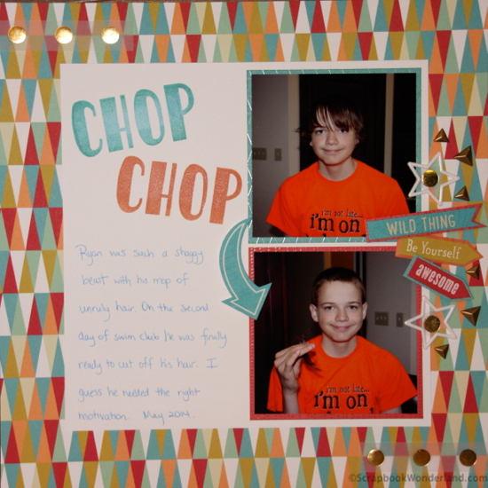
The scrapbook layout I’m sharing today features ‘Free to Be Me’ paper from Close to My Heart. Actually, all of the supplies are from Close to My Heart!
Design Tip: Working with bright colours.
This layout was designed to be quick and easy with some great details and design. When working with photos that have bright colours, like the bright orange t-shirt, you have a couple of options.
- Create a layout with bright papers to match the tone of your photos.
- Alter the photos to mute the colours or convert them black and white.
For this layout I felt that the fun hair cut theme would be better with bright paper and this specialty pack is bright with fun designs.
Featured Products
Paper:
- Free to Be Me (includes vellum with metallic dots)
Title Stamp:
- Marquee Uppercase Alphabet
Embellishments:
- Timberline Stickease (arrow and Wild Thing)
- Free to Be Me cut-off strip (Be Yourself and Awesome)
- Stars: Marquee Enamel Shapes
- Metal triangles: Durables Triangle Studs
- Ink used: Sorbet, Sunset, Crystal Blue and Lagoon
- Adhesives used: Tombow Mono, Glue Dots, Foam tape
These products and more are available for a limited time! Get them while you still can at alice.ctmh.com
Thanks for hopping! If you love scrappy tips and techniques sign up for the Scrapbook Wonderland mailing list. You’ll also receive a special free gift from me just for signing up! Your next stop on the hop is Paper Sage.
Let your creativity shine!
Alice.


Comments on this entry are closed.
Awesomely bright and colorful!
Thanks pam!
Love this layout – great mix of elements and even with the busy papers the pictures really stand out!!!
Thanks Sandra!
What a fun layout!
Thanks Brandy!
Great layout!
Thanks Julie!
Alice this is such a great example of using really colorful paper and bright photos! I love this page and all the elements! Perfect layout!
Thanks Kristie! I love that it has a lot of visual impact but is really a simple layout! Thanks for visiting and commenting!