 In this post I’m sharing a simple and elegant scrapbook layout featuring the colours of fall. Don’t miss the photo tutorial later in this post for creating softly crinkled die cut letters that will bring the feel of fall leaves to your scrapbook page.
If you are joining us from the Make it Monday blog hop you’ve hopped over here from Jen Wright’s where she shared a gorgeous template. I’ll share the next stop at the end of this post.
Fall is the only season that I scrapbook just for the sake of creating a beautiful page. Our spring is very short here, in Alberta, Canada, and it’s hard to tell that it’s even happening until it’s already over. Summer is filled with so many activities and winter is long and cold so Fall has a special place in my heart.
WonderFall Scrapbook Layout:
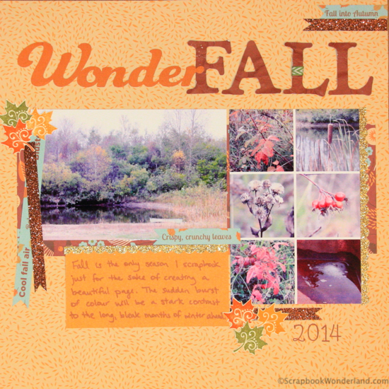
The design layout for this page was based from a sketch on the Scrap Happy website. I thought it was an interesting layout because it featured both a horizontal and a vertical photo. I played with the design a bit so I could add mini photos instead of a single vertical photo.
Details:
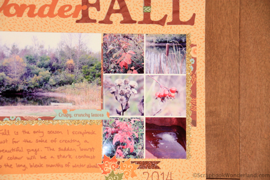
The vertical photo space is a collage of mini photos I created using a free online website called PicMonkey. If you are not ready to learn Photoshop you might want to give PicMonkey a try. You can add text to photos, do some editing and play with creative design.
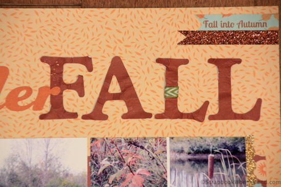
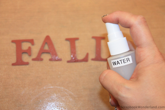
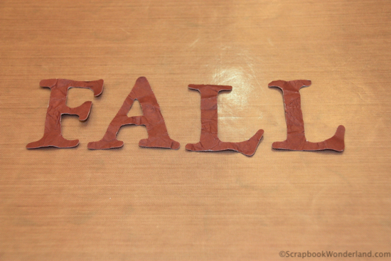
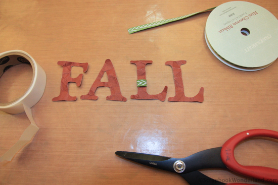
The word FALL was textured to mimic crinkly fall leaves. Want to give this technique a try?
Quick 5 step photo tutorial to make letters soft and crinkly:
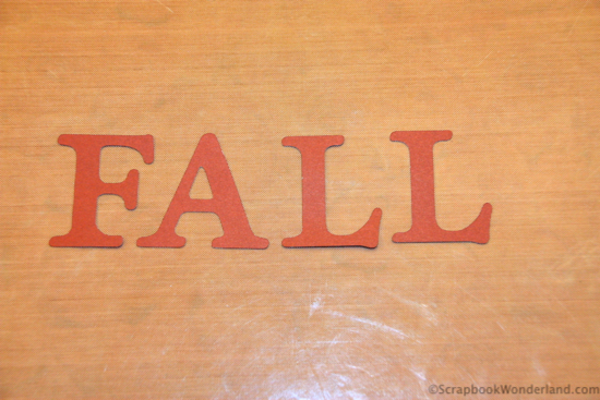
1. Cut out some die cut letters. These were created with a Cricut machine but any die cut machine will work.
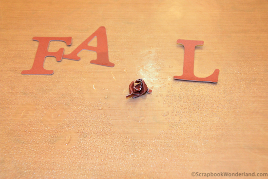
3. Gently squish up the letters being careful not to rip them. The water will make the paper more pliable.
Your next stop on the Make it Monday blog hop is to Messtaken Identity where GinaZee has a school-themed tag that will be perfect for teacher gifts! Hop HERE.
I invite you to sign up for the Scrapbook Wonderland mailing list where you’ll receive even more useful tips and tricks for creating scrapbook pages you love. Sign up HERE.
Let your creativity shine!
P.S. Want to attend THE MOST AMAZING scrapbooking live event? Click here to view more details

Comments on this entry are closed.
I love the title distressing technique.
Thanks Gina. When you soften the paper you can bend it without it tearing and that can be very convenient!
Wonderful page and photos! Love your clever title.
Thanks Lisa! I had a good chuckle as I was creating this page. 😉
Alice, this is a gorgeous page! I love the way you turned the vertical photo area from the sketch into a grid. The crinkled letters to form your title is brilliant! Thanks so much for sharing!
Thanks Kristie! I was thrilled that it was so easy to create the collage!
P.S. The bottom right photo of the collage is ice in the wheelbarrow. Definitely a sign of fall around here. 😉
this is great. I wouldn’t have thought to crumple them but yet it looks like leaves to me!! So cool!!!!!
Cool technique with the letters… Will give it a try!
Great layout…
Good luck! I’d love to know how it turns out. Thanks for commenting Diana.
Cool technique on the title.
Thanks Emily!
Brilliant idea to crinkle up the alphas! You are so dang creative, sweet Alice! Love your layout and thanks for being part of the Make It Monday hop! xoxo
Thank you Connie. You are super creative, so if you see that in me I’m happy to hear it!
I love being part of the hop. I have so many ideas that I’m bursting to share!
I really like your layout from the textured letters to the sparkly bits of tape. Your photos really shine.
Thanks Leslie! I LOVE glitter, so I often have it on my pages in some form. I’m usually trying to control the amount of glitter I allow myself to use! lol!
I really enjoyed this layout. I have crinkled seam binding with water and colored it, but never thought of letters. I have tried several types of paper now, and thickness matters (of course.) Great easy technique to play with!
The little bit of water really helps the paper to crinkle without tearing. So glad I could share this with you!